


Case Size
40.5mm
Case Material
Soft-Touch Polycarbonate
Strap
Polycarbonate (W: 27-18.5mm)
Clasp
Steel Butterfly
Bezel
Soft-Touch Polycarbonate
Caseback
316L Stainless Steel
Dial
Brass
Hands & Indexes
Brass
Glass
Anti-Reflective Coated Mineral
Movement
Quartz (3 Hands) TMI VJ21
Water Resistance & Weight
5 ATM & 54g
SKU
D1-PCBJ51
THIS DESIGN EXPLORES HOW TONAL VARIATION CAN CREATE VISUAL DEPTH.

THE EXPERIMENT
Rather than introducing multiple colors or graphic elements, this design explores how tonal variation can create visual depth. Different shades of blue work together across the dial, case and bracelet, allowing changes in light to define the watch rather than bold decoration. The result is a composition that feels calm, balanced and architectural, demonstrating how subtle shifts in tone can have as much impact as contrast.

MATERIAL SCIENCE
The lightweight polycarbonate case provides a durable structure with a soft-touch finish that produces a consistent matte appearance. This controlled surface allows tonal variations across the dial to remain the visual focus without introducing unwanted reflections. Protected by mineral glass with a blue anti-reflective coating, the layered finishes remain clear in changing light, allowing subtle differences in color and texture to emerge naturally throughout the day.

THE COLLECTION
POLYCARBON
Polycarbonate behaves differently from steel. It absorbs light rather than reflecting it, creating a softer, more controlled surface. As a result, color appears more even, with less glare and greater consistency across the watch. The material is lightweight, with a soft-touch coating that gives it a warmer, more tactile feel than metal or ceramic. This is why we use it as a core material. It gives us more control over how the watch looks and feels, allowing each design to be shaped through material, not just form.
+ DE D1 Milano Polycarbon Watch

COMMANDE POSSIBLE
5 SEMAINES
130,00 €
THIS DESIGN EXPLORES HOW SELECTIVE COLOR PLACEMENT CAN SHAPE THE CHARACTER OF THE DIAL.

THE EXPERIMENT
This design explores how selective color placement can shape the character of the dial. A dual-tone outer ring frames the display, while matching accents on the applied index tips reinforce the same visual language throughout. The grained dial provides a subtle textural backdrop, allowing color, texture and proportion to work together without overwhelming the simplicity of the design. The result is a watch that feels expressive through precision rather than excess.

MATERIAL SCIENCE
The lightweight polycarbonate case provides a durable structure with a soft-touch finish that creates an even, matte appearance. This restrained surface allows the textured dial and silver details to become the visual focus. A grained dial introduces subtle texture, while the dual-tone outer ring and matching index accents create visual definition around the display. Protected by mineral glass with a blue anti-reflective coating, the layered finishes and color transitions remain clear in changing light.

THE COLLECTION
POLYCARBON
Polycarbonate behaves differently from steel. It absorbs light rather than reflecting it, creating a softer, more controlled surface. As a result, color appears more even, with less glare and greater consistency across the watch. The material is lightweight, with a soft-touch coating that gives it a warmer, more tactile feel than metal or ceramic. This is why we use it as a core material. It gives us more control over how the watch looks and feels, allowing each design to be shaped through material, not just form.

COMMANDE POSSIBLE
5 SEMAINES
130,00 €
THIS DESIGN EXPLORES HOW SELECTIVE COLOR PLACEMENT CAN SHAPE THE CHARACTER OF THE DIAL.

THE EXPERIMENT
This design explores how selective color placement can shape the character of the dial. A dual-tone outer ring frames the display, while matching accents on the applied index tips reinforce the same visual language throughout. The grained dial provides a subtle textural backdrop, allowing color, texture and proportion to work together without overwhelming the simplicity of the design. The result is a watch that feels expressive through precision rather than excess.

MATERIAL SCIENCE
The lightweight polycarbonate case provides a durable structure with a soft-touch finish that creates an even, matte appearance. This restrained surface allows the textured dial and yellow details to become the visual focus. A grained dial introduces subtle texture, while the dual-tone outer ring and matching index accents create visual definition around the display. Protected by mineral glass with a blue anti-reflective coating, the layered finishes and color transitions remain clear in changing light.

THE COLLECTION
POLYCARBON
Polycarbonate behaves differently from steel. It absorbs light rather than reflecting it, creating a softer, more controlled surface. As a result, color appears more even, with less glare and greater consistency across the watch. The material is lightweight, with a soft-touch coating that gives it a warmer, more tactile feel than metal or ceramic. This is why we use it as a core material. It gives us more control over how the watch looks and feels, allowing each design to be shaped through material, not just form.

COMMANDE POSSIBLE
5 SEMAINES
130,00 €
THIS DESIGN EXPLORES HOW SELECTIVE COLOR PLACEMENT CAN SHAPE THE CHARACTER OF THE DIAL.

THE EXPERIMENT
This design explores how selective color placement can shape the character of the dial. A dual-tone outer ring frames the display, while matching accents on the applied index tips reinforce the same visual language throughout. The grained dial provides a subtle textural backdrop, allowing color, texture and proportion to work together without overwhelming the simplicity of the design. The result is a watch that feels expressive through precision rather than excess.

MATERIAL SCIENCE
The lightweight polycarbonate case provides a durable structure with a soft-touch finish that creates an even, matte appearance. This restrained surface allows the textured dial and silver details to become the visual focus. A grained dial introduces subtle texture, while the dual-tone outer ring and matching index accents create visual definition around the display. Protected by mineral glass with a blue anti-reflective coating, the layered finishes and color transitions remain clear in changing light.

THE COLLECTION
POLYCARBON
Polycarbonate behaves differently from steel. It absorbs light rather than reflecting it, creating a softer, more controlled surface. As a result, color appears more even, with less glare and greater consistency across the watch. The material is lightweight, with a soft-touch coating that gives it a warmer, more tactile feel than metal or ceramic. This is why we use it as a core material. It gives us more control over how the watch looks and feels, allowing each design to be shaped through material, not just form.

COMMANDE POSSIBLE
5 SEMAINES
160,00 €
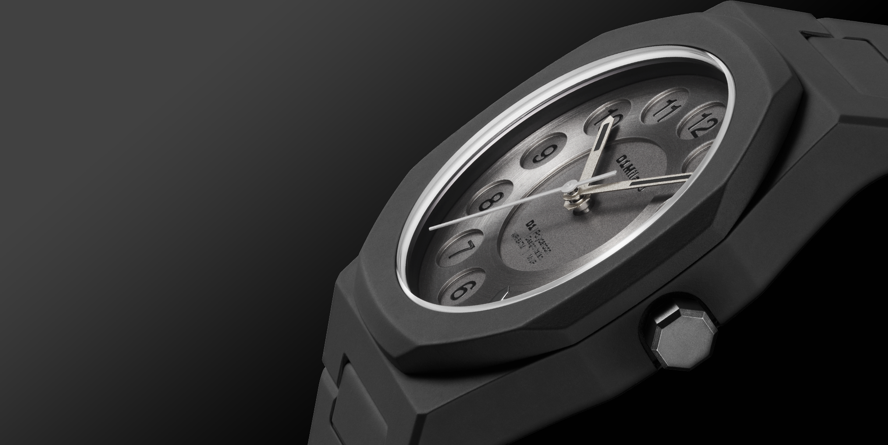
EXPLORING HOW A FAMILIAR REFERENCE CAN BE EXPRESSED THROUGH FORM, MATERIAL AND CONSTRUCTION.
THE EXPERIMENT
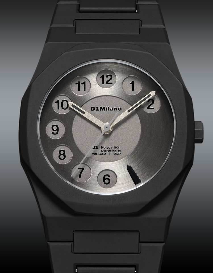
Rather than reproducing the appearance of a rotary telephone, this design explores how a familiar reference can be expressed through form, material and construction. Inspired by the numbered discs of 1960s and 1970s rotary phones, the double-layer dial recreates the characteristic geometry through contrasting circular brushed and sandblasted finishes. The result recalls an iconic industrial object without relying on literal representation, balancing familiarity with contemporary simplicity.
MATERIAL SCIENCE
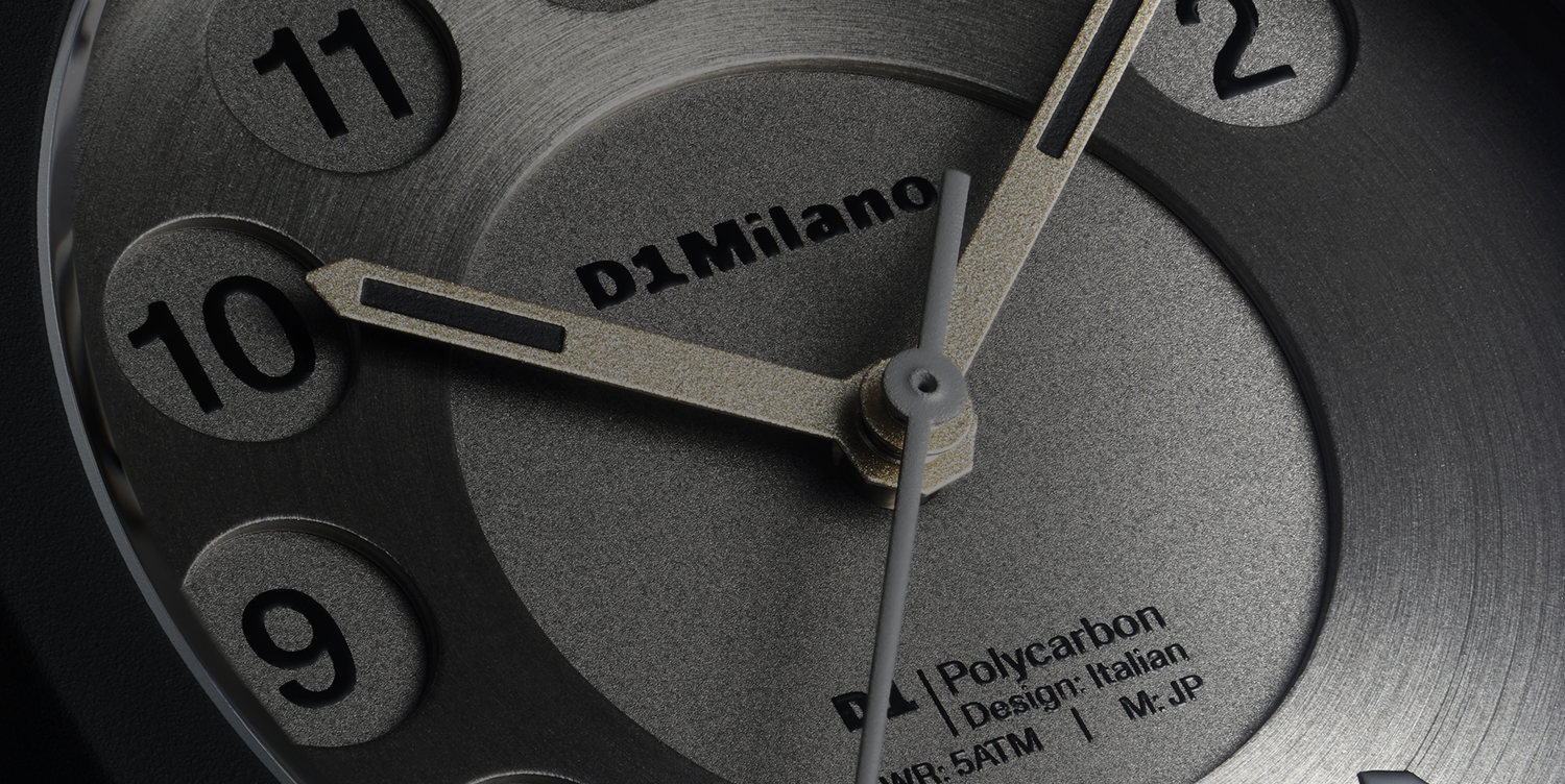
The dial combines two distinct surface treatments to create depth and definition. A circular brushed upper layer catches the light differently from the sandblasted lower layer, allowing the geometry of the design to emerge through texture rather than color. The lightweight polycarbonate case provides a soft-touch matte finish that frames the layered dial without competing for attention, while mineral glass with a blue anti-reflective coating preserves clarity across the different surface finishes.
THE COLLECTION
POLYCARBON
Polycarbonate behaves differently from steel. It absorbs light rather than reflecting it, creating a softer, more controlled surface. As a result, color appears more even, with less glare and greater consistency across the watch. The material is lightweight, with a soft-touch coating that gives it a warmer, more tactile feel than metal or ceramic. This is why we use it as a core material. It gives us more control over how the watch looks and feels, allowing each design to be shaped through material, not just form.

COMMANDE POSSIBLE
5 SEMAINES
160,00 €
THIS DESIGN EXPLORES HOW TONAL VARIATION CAN CREATE VISUAL DEPTH.
THE EXPERIMENT
Rather than introducing multiple colors or graphic elements, this design explores how tonal variation can create visual depth. Different shades of blue work together across the dial, case and bracelet, allowing changes in light to define the watch rather than bold decoration. The result is a composition that feels calm, balanced and architectural, demonstrating how subtle shifts in tone can have as much impact as contrast.
MATERIAL SCIENCE
The lightweight polycarbonate case provides a durable structure with a soft-touch finish that produces a consistent matte appearance. This controlled surface allows tonal variations across the dial to remain the visual focus without introducing unwanted reflections. Protected by mineral glass with a blue anti-reflective coating, the layered finishes remain clear in changing light, allowing subtle differences in color and texture to emerge naturally throughout the day.
THE COLLECTION
POLYCARBON
Polycarbonate behaves differently from steel. It absorbs light rather than reflecting it, creating a softer, more controlled surface. As a result, color appears more even, with less glare and greater consistency across the watch. The material is lightweight, with a soft-touch coating that gives it a warmer, more tactile feel than metal or ceramic. This is why we use it as a core material. It gives us more control over how the watch looks and feels, allowing each design to be shaped through material, not just form.

COMMANDE POSSIBLE
5 SEMAINES
195,00 €
EVERY DIAL IS UNIQUE, BALANCING ORGANIC VARIATION WITH ARCHITECTURAL PRECISION.

THE EXPERIMENT
Rather than treating the dial as a flat surface, this design explores how individual elements can create a unified whole. Geometric forms and fluid veining are brought together within a precise framework, creating a marbled surface inspired by natural stone mosaics. Every dial is unique, balancing organic variation with architectural precision while the neutral Polycarbon case acts as a quiet frame.

MATERIAL SCIENCE
The glossy resin dial allows color and pattern to flow naturally across the surface, creating a marbled effect with depth and variation. Because each dial develops its own arrangement of geometric forms and veining, no two watches are exactly alike. The lightweight polycarbonate case provides a smooth, matte contrast that frames the dial without competing for attention, balancing expressive surface detail with the clean geometry of the Polycarbon platform.

THE COLLECTION
POLYCARBON
Polycarbonate behaves differently from steel. It absorbs light rather than reflecting it, creating a softer, more controlled surface. As a result, color appears more even, with less glare and greater consistency across the watch. The material is lightweight, with a soft-touch coating that gives it a warmer, more tactile feel than metal or ceramic. This is why we use it as a core material. It gives us more control over how the watch looks and feels, allowing each design to be shaped through material, not just form.


